Cool station of the day
As has been pointed out by others, Tony Watt's surface station site features the hot, which bothers many readers. Several really good posts have asked whether they really are so hot, and whether this makes a difference in the long run, a station that is hotter than the surrounding area being balanced by one(s) that are cooler. Eli and the bunnies are starting a new feature "Cool station of the day"
Now where would a Rabett find a cool US weather station? Perhaps where the most cooling has been seen in the US, the southeast, and yo there it is, the whole package, Bainbrige GA, a GISS rural station,
UPDATE: The rake in the face crowd demands to see the temperature data.
Like Eli told you real cool. For fun, think of how the as nearby trees grow over the years, the amount of shade increases linearly leading to increasing cooling.
Tuesday, August 21, 2007

Sunday, May 15, 2011
Rabett Is Always Right
Back at the beginning of time, Eli pointed out that Tony Watts' Surface Station of the Month Club was turning up as many stations with bad cooling features as with warming ones. Some are shown on the right from Rabett Run's Cool Station of the Day feature back in September 2007. This was not taken well and there were some real classics over there
Ste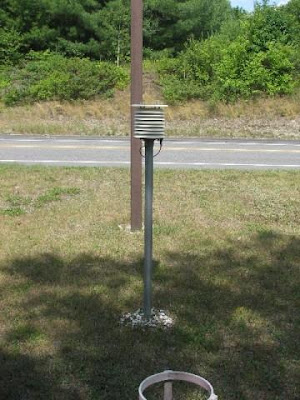 ve Bloom put it well;
Well, guess we have. Time to pay up Tony. Since there is no such thing as a free lunch, Eli will accept a dinner.So little time, so many baseless assumptions:
1) Eli's point is that your material is basically self-cancelling within its own terms. If he were using it for any other purpose, you might have an argument. As it is, you don't.
[MODERATOR NOTE - on #1 I get what he's trying to say, but we'll see when its all tallied. So far there does not appear to be a balance as has been suggested.]
And then there was maybe Jeff ID with
Eli summed it up in a comment at Rabett Run
The point is thatNow Eli is not one to gloat, but simply wishes to point to a paper under discussion
a. There are both negative and positive biases at the various USHCN network stations
b. Eli can find a lot more stations with negative biases in the surface station picture gallery.
c. The net effect will be to broaden the distribution, but not change the means (by anything meaningful).
d. That's what you get when you are too cheap to run your own system.
Fall, S., A. Watts, J. Nielsen-Gammon, E. Jones, D. Niyogi, J. Christy, and R.A. Pielke Sr., 2011: Analysis of the impacts of station exposure on the U.S. Historical Climatology Network temperatures and temperature trends. J. Geophys. Res., in press. Copyright (2011) American Geophysical Union.
Which pretty much says Watt Eli Said
Whooda thunk
Thursday, September 20, 2007
Ethon checks out the air conditioning. . .
UPDATE: As Boris says in the comments:
Paul is right on here, which explains why the denialist side is so interested in pushing this nonsense. It doesn't matter if the trends aren't changed at all by microsite issues, doesn't matter at all that satellite data matches the surface trends extremely well, even for the US region. What matters is that we have a propaganda tool to mislead the public, the same way we mislead the public with the increases of high altitude glaciers, the lag between temp and CO2 in the ice record, erasing Hansen's graphs, and on and on and on and on...
UPDATE: BCL has some rather good stuff on the ways of the righteous and scientifical or at least how to do the job right. Curiously, very similar to what has been recommended here.
Ethon had been looking over the real estate ads at surface stations and having seen some promising properties he went out west checking out the Class 5 stations for one with a nice nesting place, A/C and perhaps a hibachi to cook the daily liver on. On the way back he dropped in at NOAA and ran into TC Peterson in the cafeteria. Tom was happily munching on his chopped liver sandwich (believe me folks it is ALL chopped liver).
Ethon and TC fell to nattering about the seminal paper by Davey and Pielke which, with little exaggeration, could be pointed to as the seed for all the heavy breathing. They did a bit of surfing and indeed did find the smoking BBQ at the defunct Climate Science blog in a comment from Roger Sr.
Thanks Dave for your comment. Their adjustments do not address the issue of whether unrecognized systematic biases are still retained due to poor microclimate exposure and its change over time. Our recommendation is that each station used to construct the USA and global land-surface temperature data record be photographed, in the manner presented in http://blue.atmos.colostate.edu/publications/pdf/R-274.pdf. As other examples of sites, we are compiling photographs on our web site (e.g., see http://ccc.atmos.colostate.edu/Alaskacoopsites.php) (with more to come).Davey and Pielke took their Brownies and photographed some stations out in the mountain west. Out of the 10 stations that posed, six were in the USHCN network, two were "good" and four "bad". TC, being essentially the source of all homogenizations guy at NOAA (don't take this too literally) had examined the photos that Davey and Pielke relied on and looked at the data. As he said
Essentially there are two competing hypotheses about the effects of poor siting that yield very different predictions. The first hypothesis is that homogeneity adjustment methodologies would account for changes to locations with poor siting. If the homogeneity adjustments are appropriately accounting for all artificial changes at the stations, then an adjusted temperature time series from the poorly sited stations should be very similar to the time series from the stations with good siting. The trends from the poorly sited stations may be a little higher or a little lower, but they should still be about the same. This hypothesis would, of course, also hold if poor siting did not cause a bias in the original data and the homogenization did not introduce any biases. The second hypothesis is that poor current station siting produces an artificial bias in the temperature record that is not being addressed by homogeneity adjustments. While Davey and Pielke suggested that poor siting–induced bias could be positive or negative,a point that appears to have been lost at Surface Stations although not Rabett Run as attested by some mouth foaming comments to our Cool Station of the Day series
the underlying concern about the effects of potential siting biases is whether a significant portion of the recent warming indicated by the U.S. and global temperature record could be due to this bias rather than climate change. Therefore, the second hypothesis predicts that homogeneity-adjusted temperature trends at the poorly sited station would be significantly different than the temperature trends at the stations with good siting, and that these differences would most likely be that the poorly sited stations are warming relative to nearby stations with good sitingPeterson ran the numbers, and in the words of Anthony Watt
But hey, they can "fix" the problem with math and adjustments to the temperature record.which, of course is what Peterson found: that the trends for the good, the bad and the not very nice looking were the same after homogenization.
 Now, of course, our friends in Boulder were not about to take this without some harumphing
I assumed the Peterson article would also be published with a Reply from Christopher Davey and I. However, despite my requests to permit us to prepare a Reply to the Peterson article, it was decided that there was new information in the Peterson article. My request was refused. I was written thatEli, being a RTFR kinda Rabett went and RTFR, which has been published now. The interesting part is the conclusion
“In the case of your 2005 article, Jeff Rosenfeld felt that since your work raised significant (though potentially justified) criticism of an observing network that the entire scientific community relies upon and would impact the public confidence in those networks, that a companion comment was appropriate to provide additional perspective. This does not appear to be the case with Peterson’s current article, which is simply providing scientific evidence to clarify arguments for alternative hypotheses.” [Jeff Rosenfeld is Editor-in-Chief of the Bulletin of the American Meterological Society].
Since the Peterson article claims to resolve the problem, yet we have serious issues with his contribution, it would seem that the same approach of two articles would have been permitted. Nonetheless, this was not allowed. This imbalance in the ability to present climate science viewpoints unfortunately permeates the scientific literature including that of the Bulletin of the American Meteorological Society (BAMS).
We have, therefore, written an article for BAMS in response to the Peterson article, and it is authored and titled
Pielke Sr., R.A, C. Davey, J. Angel, O. Bliss, M. Cai, N. Doesken, S. Fall, K. Gallo, R. Hale, K.G. Hubbard, H. Li, X. Lin, J. Nielsen-Gammon, D. Niyogi, and S. Raman, 2006: Documentation of bias associated with surface temperature measurement sites. Bull. Amer. Meteor. Soc., submitted. [it should not yet be cited or reproduced as it is currently under review; comments to us on the manuscript, however, are welcome].
As Davey and Pielke (2005) documented and Peterson (2006) acknowledges, several USHCN stations are poorly sited or have siting conditions that change over time. These deficiencies in the observations should be rectified at the source, that is, by correcting the location and then ensuring high-quality data that are locally and, in aggregate, regionally representative. Station micrometeorology produces complex effects on surface temperatures, however, and, as we show in this paper, attempting to correct the errors with existing adjustment methods artificially forces toward regional representativeness and cannot be expected to recover all of the trend information that would have been obtained locally from a well-sited station.Translated from the we refuse to admit we were wrong this means that homogeneity adjustments do recover regional (and thus continental) and global trends BUT, of course local information is lost and it would be better to have better stations. Let the perfect be the enemy of the useful and tally-ho.
Saturday, October 13, 2012
Wattsbusters
 Saturday night is date night Ms. Bunny calls, so Eli is turning the keys over to an evil bunny with nasty big pointy teeth, aka the Rabett of Caerbannog. He (well Eli was not going to get close enough to really tell, those nasty pointy teeth you know, and the lack of the Holy Hand Grenade of Antioch) spent his spare time learning Python to put the Wattsbuster package together. It displays global-average temperature estimates from
stations interactively selected by a user (on a global
map). The package (it is not yet totally user friendly) strips away the mystery behind the NASA/NOAA/CRU
global-temperature computations for non-technical folks. Being
able to *show* the non believers rather than just *telling* them seems to be
helpful... Instructions on downloading and installation can be found at the end of this post and a FAQ follows (btw this is Caerbannog's post)
Saturday night is date night Ms. Bunny calls, so Eli is turning the keys over to an evil bunny with nasty big pointy teeth, aka the Rabett of Caerbannog. He (well Eli was not going to get close enough to really tell, those nasty pointy teeth you know, and the lack of the Holy Hand Grenade of Antioch) spent his spare time learning Python to put the Wattsbuster package together. It displays global-average temperature estimates from
stations interactively selected by a user (on a global
map). The package (it is not yet totally user friendly) strips away the mystery behind the NASA/NOAA/CRU
global-temperature computations for non-technical folks. Being
able to *show* the non believers rather than just *telling* them seems to be
helpful... Instructions on downloading and installation can be found at the end of this post and a FAQ follows (btw this is Caerbannog's post)
Unlike many other aspects of climate-science (hockey-stick with
principal components, regressions, etc.), the global-temperature anomaly,
involving nothing more than simple averaging, is something that bunnies can
explain to non-technical friends/relatives in a way
that they actually *get it* (at least to some extent).
This seems to be the Watts-skeptic crowd's biggest vulnerability --
they've gone out on a limb by being consistently wrong about stuff that I
can explain to high-school/junior-college-educated folks...
FAQ:
###### 1. How we can know what the earth's temperature is ########
 Basically, you average together a whole bunch of measurements over the Earth's surface.
But it should be made clear that the NASA/NOAA/CRU are more interested in quantifying
how average surface temperatures have *changed* than in just calculating the
"Earth's temperature".
Look at the Y-axis of one of the NASA global-temperature plots. What you will see
is a Y-axis range of on the order of -1 deg C to +1 deg C.
Obviously, the Earth's temperature does not lie between -1 and +1 degrees. What
the NASA plots show is how the average of the temperature measurements taken by GHCN
stations has *changed* over time.
Basically, you average together a whole bunch of measurements over the Earth's surface.
But it should be made clear that the NASA/NOAA/CRU are more interested in quantifying
how average surface temperatures have *changed* than in just calculating the
"Earth's temperature".
Look at the Y-axis of one of the NASA global-temperature plots. What you will see
is a Y-axis range of on the order of -1 deg C to +1 deg C.
Obviously, the Earth's temperature does not lie between -1 and +1 degrees. What
the NASA plots show is how the average of the temperature measurements taken by GHCN
stations has *changed* over time.
It should be emphasized that we aren't interested so much in calculating the Earth's absolute
temperature as we are in estimating how it has *changed* over time.
Here is a basic summary as to how to compute average temperature changes from GHCN data.
1) For each station and month, calculate the average temperature over the 1951-1980 period.
i.e. for each station, average all the Jan temps over the 1951-1980 period to produce
the January baseline average temp for that station. Do the same for the
Feb, Mar, ... etc. temps.
For any given month, stations with insufficient data to compute 1951-1980 baselines
are thrown out (that will still leave you with many thousands of stations for
every month of the year). What constitutes "sufficient data" is a judgement call --
I require at least 15 out of 30 years in the baseline period. NASA requires 20 (IIRC).
Results are very insensitive to this (10, 15, 20, etc. years all produce very similar results).
You will end up with a 2-d array of baseline average temperatures,
indexed by GHCN station number and month.
2) For every temperature station, subtract that station's Jan baseline average from
the Jan temperatures for all years (1880-present). Do the same for Feb, Mar,
Apr, etc.
These are the station monthly temperature *anomalies*. "Anomaly"
is just a $10 word for the difference between a station's monthly
temperature for any given year and that station's baseline average
temperature for that month.
3) The crudest, most-dumbed-down procedure to compute global-average
temperature anomalies is simply to average together the monthly
anomalies for all stations for each year. This is a very crude
technique that will still give you not-too-bad "ballpark" global
average estimates.
4) The problem with (3) is that stations are not evenly distributed
around the globe. (If stations were uniformly spaced all over the
Earth, the method described in 3 would be ideal).
With method (3), regions with dense station coverage (like the continental
USA) would be over-weighted in the global average, while less densely-sampled
regions (like the Amazon region, Antarctica, etc.) would be under-weighted.
To get around this problem, we divide up the Earth's surface into grid-cells.
Then we compute the average temperature anomalies by applying (3)
just to stations in each grid cell to produce a single average
anomaly value per month/year for each grid-cell. Temperature values for all
stations in each grid-cell get merged into a single average value for that grid-cell.
Then we just average all the grid-cell values together for each year to
produce the global average temperature anomalies.
Note:
The surface areas of fixed lat/long grid-cells change
with latitude, so you will need to scale your results by the grid-cell
areas to avoid over-weighting high-latitude temperature stations.
An alternate approach is to adjust the grid-cell longitude dimensions
as you go N/S from the Equator to ensure that the grid-cell areas are
approximately equal. The grid-cell areas won't be identical (because your
grid-cell longitude sizes are limited to integer fractions of 360 degrees),
but they'll be close enough to identical to give very good results.
(i.e. good enough for "blog-science" work).
5) The gridding/averaging procedure in its most rudimentary, stripped-down
form is quite simple But it still produces surprisingly good global-average results.
The one pitfall of the above method is that if you use the NOAA/CRU standard
5deg x 5deg grid-cell size, you will end up with many more "empty" grid-cells
in the Southern Hemisphere than in the Northern Hemisphere. This will cause
the NH (where there has been more warming) to be over-weighted relative to
the SH (where there has been less).
So if you don't compute interpolated values
for the empty grid-cells, your warming estimates will be too high (i.e. higher
than the NASA results).
But you divide up the Earth into 20 deg x 20 deg (or so) grid-cells, you
will get results amazingly close to the official NASA results without having
to bother computing interpolated values for "empty" grid-cells (because
you made the grid-cells big enough that none of them will be empty). It's a
crude short-cut, but it's a lot less work than doing all the interpolations,
and it still gives you pretty darned-good global-average results.
######## 2 What sort of games Watts has been playing ###############
The big problem with the Watts approach is that he and his followers
have not bothered to perform any global-average temperature calculations
to test the claims they've been making (i.e. claims about UHI, homogenization,
"dropped stations", etc.)
IOW, they have failed to perform any serious data analysis
work to back up their claims.
Had they done so, they would have found what I have found, namely:
1) Raw and adjusted/homogenized station data produce very similar global average results.
2) Rural and urban station data produce nearly identical global-average results.
3) The "dropped stations" issue pushed by Watts is a complete non-issue. Compare results computed with all stations vs. just the stations still actively reporting data (separating them out is a very easy programming exercise), and you will get nearly identical results for all stations vs. just the stations that haven't been "dropped".
4) The GHCN temperature network is incredibly oversampled -- i.e. you can reproduce the warming trends computed by NASA/NOAA with raw data taken from just a **few dozen** stations scattered around the world. I was able to replicate the NASA long-term warming trend results very closely by crunching *raw* temperature data from as few as *32* rural stations scattered around the world.
####### 3 How real skeptics can beat him by reducing the data themselves ######
The best approach is to roll up their sleeves and compute their own global average temperature estimates for a bunch of different combinations of globally-scattered stations. Skeptics with sufficient programming experience should not have much trouble coding up their own gridding/averaging routines from scratch, in their favorite language. They can even use python -- it's amazingly fast for a "scripting" language. Skeptics without programming experience will just have to trust and run code written by others.
####### 4 Where to get that data ##########
NASA and NOAA have had long-standing policies of making all of the raw and adjusted temperature data they use freely available to the public.
The GHCN monthly data can be downloaded from here: ftp://ftp.ncdc.noaa.gov/pub/data/ghcn/v3/
The GHCN daily data can be downloaded from here: ftp://ftp.ncdc.noaa.gov/pub/data/ghcn/daily/
Note: Unless you are a masochist who wants to write a lot mind-numbing low-level data handling code, just use the monthly data.
-----------------------------------------------------
The whole ball of wax (including GHCN V3 data) can be downloaded from tinyurl.com/WattsBusterProject
Need to give a shout-out to the authors of the socket code and the QGIS software package -- most of the "heavy lifting" was done by those guys. (QGIS and python are *really* cool, BTW -- this project was my first serious intro to python). Also, here's a quick summary (minus a lot of cluttering details) of the installation/operation procedure
1) Make sure that gcc/g++, gnuplot, X11 and QGIS are installed.
(Easiest on a Linux Box)
2) Unpack the WattsBuster zip files
3) Launch QGIS.
On the top menu bar, go to Plugins->Fetch Python Plugins
Find and install the Closest Feature Finder plugin.
4) Shut down QGIS
5) Copy the closest_feature_finder.py file supplied in the WattsBuster package
to the appropriate QGIS plugin folder (typically ~/.qgis/python/plugins/ClosestFeatureFinder/)
6) In the WATTSBUSTER-1.0.d directory, build the anomaly.exe executable as follows:
make clean; make
7) Launch the executable per the supplied script:
./runit.sh
8) Launch QQIS
Load the supplied QGIS project file (GHCNV3.qgs)
Start up the Closest Feature Finder plugin and connect to the anomaly.exe
process.
9) Select a GHCN station layer and start ctrl-clicking on random stations.
This is not a polished end product; think of it as a "proof of concept" prototype..
Tuesday, September 04, 2007
Somewhat boring but let's keep the guys over at Climate Audit amused.
Although the bunnies are always looking for better burrows, we disclaim responsibility for the large number of folk surfing surfacestations.org. However, we have the next real cool site from Anthony Watts' collection, and what is cooler than Berkeley?
Our cool station of the day.
An air conditioner or a shadow do not a trend make. We can find at least as many cooling flaws in the USHCN network than warming ones, yet the surface record trend agrees with trends in other series such as the corrected satellite MSU, the sea surface temperature and more. A major problem with all the jumping up and down is, as Eli has pointed out forevah, that it is not clear how the associated offsets will affect the multiyear trend. But there goes the baby with the bathwater
Oh yeah, take a look at what the Sparrow has wrought
Monday, September 03, 2007
Cool station of today . . .
Alma MI, with the Stevenson Screen right next to a large bush and a tree to the south to provide shade
The report describes this as an urban back yard shaded in the morning and late afternoon. Wanna bet that is an Urban Cooling Effect.
As Eli said for every air conditioner there is a tree, for every piece of blacktop a bush.
Monday, August 20, 2007
No Exit
Jean Paul SarteSartre taught the bunnies that hell was the people you had to spend eternity with. He was wrong. Hell is Philadelphia International Airport with the USAIR grim reaper training class canceling flights to every destination. Terminal F being the lowest circle, we are now scheduled to board a bus somewhere in the wee hours that will circle the airport endlessly. Like poor Charlie, Eli may never return.
However, to keep you amused here is an interesting picture of a surface station, the one that Eli knew when he was a SarteSartre fan, walking the streets of the Village, being cool (well he tried) and all that.
Eli recalls walking into Central Park, near the Belvedere Castle to go see Joe Papp's Shakespeare in the Park productions and the huge change in temperature as one left Fifth Avenue, and how the weather station was located in a lovely, leafy grove. See you one air conditioner
UPDATE Those who must be obeyed pointed out that Eli had forfeited any claim to pseudo intellectual appearance by misspelling Sartre. Au contraire mon mice, this only nails the sucker to the wall. For pointing this out the anonymouse wins the hall of hell (Philadelphia International Airport) fun alarm. A 220 dB tooth extractor that used to hang over the baggage carousel that refused to spit up our stuff because it had been sitting out in the rain for four hours and didn't taste good. We've also relinked the picture so that all can see.
Thursday, January 21, 2010
The hedgehog and the hyena
It is pretty clear that the hedgehogs of the world understand what the hyenas don't, that given enough measurements the imperfections in individual weather stations average out and you are left with reliable trends, at least if you understand what area averaging is and how to correct for things like the time of day that different folks measure at. John V (in the comments, and the graphs have disappeared in the reorganization of the site, here they are, thanks to Valtteri Maja and Zeke Hausfather) at Climate Audit and later at Hyena Watt's place figured that out early when he compared the trends in the best and the worst stations and found essentially no difference..
However, there are surprise s. The bunnies bring words in several threads at Rabett Run that Matthew J. Menne, Claude N. Williams, Jr., and Michael A. Palecki from the NOAA/National Climatic Data CenterNational Climate Data Center have been looking at dirty pictures of weather stations in the US Historical Climatology Network (USHCN), and those in the carefully sited, but new US Climate Reference Network (USCRN) and come to the conclusion:
Recent photographic documentation of poor siting conditions at stations in the U.S. Historical Climatology Network (USHCN) has led to questions regarding the reliability of surface temperature trends over the conterminous U.S. (CONUS). To evaluate the potential impact of poor siting/instrument exposure on CONUS temperatures, trends derived from poor and well-sited USHCN stations were compared. Results indicate that there is a mean bias associated with poor exposure sites relative to good exposure sites; however, this bias is consistent with previously documented changes associated with the widespread conversion to electronic sensors in the USHCN during the last 25 years. Moreover, the sign of the bias is counterintuitive to photographic documentation of poor exposure because associated instrument changes have led to an artificial negative (“cool”) bias in maximum temperatures and only a slight positive (“warm”) bias in minimum temperatures. These results underscore the need to consider all changes in observation practice when determining the impacts of siting irregularities. Further, the influence of non-standard siting on temperature trends can only be quantified through an analysis of the data. Adjustments applied to USHCN Version 2 data largely account for the impact of instrument and siting changes, although a small overall residual negative (“cool”) bias appears to remain in the adjusted maximum temperature series. Nevertheless, the adjusted USHCN temperatures are extremely well aligned with recent measurements from instruments whose exposure characteristics meet the highest standards for climate monitoring. In summary, we find no evidence that the CONUS temperature trends are inflated due to poor station siting.
Thursday, September 18, 2008
A light dawns

There are styles in science. Tamino, for example likes to look at statistical models. James Annan thinks about priors, Gavin Schmidt cranks up his GCM, Stoat goes rowing (we exaggerate for effect). Eli, OTOH, likes to think about and then do simple experiments or calculations (BOE aka Fermi problems: some interesting examples)
Recently, this blog, and others went to the mattresses about the idea that the greenhouse effect acts like a blanket. As you may recall Atmoz had previously used an actual blanket and concluded that blankets cut off convection and conduction, but don't have much effect on radiation. Eli pointed out that survival blankets do cut off radiation, but several people thought that they also cut off convection. For those of you who don't know, a survival blanket is a thin piece of plasticized metal foil that you wrap around yourself when the heat goes out on the space station, or your return capsule lands in Siberia. If you go to Eli's link you will see an example.
So Eli started thinking and came up with the following. Take a lightbulb and wrap it tightly with a thin layer of aluminum foil. This cuts off radiation from the light bulb (the lamp light is reflected from the shiny foil), but since the foil is a good heat conductor, conduction and convection from the surface of the foil should be pretty much unchanged with or without the foil.
This is an experiment that you should ONLY do if you have a clue about handling electical stuff. There IS a significant shock hazard if you let the foil touch the metal base of the lamp, but Eli IS an electric bunny, and stuffers are insulators, so he took a 75 W incandescent lamp and put it into a drop light (there is some danger of the lamp shattering if the temperature gets too high) and turned it on. Eli found that the top of the lamp was hottest, and he measured the temperature with a thermocouple (it's handy to have a lab): 160 +/- 5 C. Next he turned the lamp off, let it cool and wrapped it with a single layer of thin (cheap) aluminum foil and turned the lamp on again: 300 +/- 5 C.
Eli rests his case, besides which he just heard some guy on the Weather Channel talking about how clouds and water vapor act like thermal blankets when the sun goes down, and how it cools off a lot faster when the sky is clear and it is dry.
DO NOT DO THIS UNLESS "YOU" KNOW HOW TO WORK WITH LIVE ELECTRICAL EQUIPMENT. Eli Rabett, Rabett Labs and everyone else assumes no responsibility for anyone who tries to duplicate this. There is a significant chance you could be nominated for a Darwin Award if you are careless.
Read the Comments
Saturday, August 04, 2007
Trashburning dynamics
Heat flow by convection can be visualized by Schlieren photography in which density differences can be clearly seen. Schlieren photography is closely related to what we commonly refer to as watching the heat rise off hot asphalt, but is much more sensitive (a paper by Gary Settles gives several examples). Horatio Algeranon (a very punny anonymouse) picked up on this, and found a picture showing that the heat flow from a charcoal grill is pretty much straight up. But even Ethon knew this, if he stands to the side when grilling his liver McClimateAudit burgers, things are relatively cool, but bend over and put his beak above the coals, and sure enough it gets fried.
Which brings up to one of Anthony Watts' favorite surface station views
so how does the heat flow
straight up, heating of the air on the sides in contact with the barrel is minimal as seen by the lack of structure.
We have heard a lot about AC units. We even have the famous Marysville picture Eli walked by a large one yesterday, there was very little airflow a few feet to the side. Schlieren shows the same
Saturday, December 13, 2008
A bit of housework
Unlike the lazy Stoat, Eli occasionally updates his blogroll. In addition to instigating Werner Aeschbach-Hertig's Reality Check, Eli has been negligent in adding it to his list although he did mention it early on.
Oh wonder, how many goodly climate blogs are there now, this time we are adding (again late) Barry Brook's Brave New Climate. As Orwell (?) explained, BNC stands as a bulwark
"...By the year 2050 - earlier probably - all real knowledge of Oldscience will have disappeared. The whole literature of the past will have been destroyed. Evolution, climate science, vaccinations - they'll exist only in Newscience versions, not merely changed into something different, but actually changed into something contradictory of what they used to be. Even the literature of Oldscience will disappear. Even the slogans will change. How could you have a slogan like "CO2 is life" if you don't abolish the concept of reality? The whole climate of thought will be different. In fact there will be no thought, as we understand it now. Denialism means not thinking - not needing to think. Denialism is incoherence..."
 UPDATE: In the comments Barry updates Eileen O'Shaunghnessy's, (Eric Blair's wife, look it up bunnies) poem End of the Century-1984
"...Hansen's bones are quiet at last,
...No science disturbs the lucid line,
For sun-scorched Earthers tune their thought
To Offword Station 'Holocene-1'
From where they know just what they ought,
...memories of times past that should be banished
Only relics, philosophies and a parched wasteland lie below..."
Also, welcome to Greenfyre, a lovely taste of which starts
I am Ngudima Madriguru, Climate Minister of my country. On behalf of my family (the Abacha’s), my country and the Free World I would like to seek your advice and help.Green has a great candidate for the 2008 Tim Ball Award.
I have data that proves human caused climate change is a hoax, but UN thugs intent on world domination are keeping me from sharing it with you.
There is proof that I dare not reveal yet. The earth is cooling even though all of the science shows it is not. The sun is what is making the Earth warmer even though the sun is in a cool phase. The Arctic ice is expanding even though there is less of it. The sea is shrinking even as it rises. The glaciers are advancing even though they appear to be shrinking. I have the evidence!
Finally we added the Klimalounge, which features posts by Stefan Rahmstorf
Admittedly the blogroll on this site is ideosyncratic and not complete. OTOH it is Eli's blog however we are always interested in suggestions.
Other suggestions?
Friday, August 12, 2011
Our permanent robotic presence in space
Nothing insightful in this post, just something in the "space is cool" category that I hadn't seen written elsewhere.

 Posts
Posts


