Critical Review of Robinson, Robinson, and Soon’s “Environmental Effects of Increased Atmospheric Carbon Dioxide”

prepared by Mike Powell (December 20)
This document is a critical review of the first four pages of “Environmental Effects of Increased Atmospheric Carbon Dioxide,” by Arthur B. Robinson, Noah E. Robinson, and Willie Soon, which was published in the Journal of American Physicians and Surgeons in 2007 (12:79-90). Mike Powell (Kennewick, Washington) prepared this review in December 2007. The review is organized in a point-by-point format starting with the second paragraph of Robinson et al. and working forward through their paper. Quoted text below is from Robinson et al. unless otherwise noted.
UPDATE: Another critical review, by Michael McCracken is available
1. first page, 2nd paragraph. “When we reviewed this subject in 1998 (1, 2), existing satellite records were short and were centered on a period of changing intermediate temperature trends.” It’s not entirely clear what they mean by “changing intermediate temperature trends, but it’s worth noting that their previous paper devotes a considerable amount of attention to the old Spencer and Christy MSU data that did not show a warming trend (e.g., Figures 6 through 8 in that paper). Now that some errors in the Spencer/Christy analysis have been fixed, the satellite data do show warming. It appears as though the Robinson et al. (2007) appeal to “changing intermediate temperature trends” is an attempt to avoid direct mention of the fact that one of the principal arguments they made in 1998 has since proved to be false.
2. 3rd paragraph and Figure 1. The temperature data shown in Figure 1 are for the Sargasso Sea – not the “average temperature of the Earth”. Note that the Sargasso Sea area of 2 million sq. miles amounts to only 1% [Corrected from 0.0011% thanks to Anon in the Comments] of the Earth’s surface area. That’s a rather small fraction and it’s unlikely that temperature variations in such a small region provide a direct measure of the magnitude of global temperature variations.
----------------------------------------
 Figure 1: Surface temperatures in the Sargasso Sea, a 2 million square mile region of the Atlantic Ocean, with time resolution of 50 to 100 years and ending in 1975, as determined by isotope ratios of marine organism remains insediment at the bottom of the sea (3). The horizontal line is the average temperature for this 3,000-year period. The Little Ice Age and Medieval Climate Optimum were naturally occurring, extended intervals of climate departures from the mean. A value of 0.25 °C, which is the change in Sargasso Sea temperature between 1975 and 2006, has been added to the 1975 data in order to provide a 2006 temperature value.
-----------------------------------------------
The data at the left-most end of the plot (showing a rise from 24 to 25 oC) do not appear in their earlier paper (Robinson et al. 1998), nor does it appear in the Keigwin (1996) paper they reference for this figure. It’s not clear why this additional data would’ve been added to the figure.
Keigwin notes that the temperature variability seen in the plot (Figure 4B in his paper) reflects both sea surface temperature (SST) and salinity variations. He estimates that only about 2/3 of the apparent variation is due to SST changes. This means that the magnitude of the variations shown in the graph are probably less by something around one third.
Keigwin’s paper is not an attempt to reconstruct global temperatures or even northern hemisphere temperatures. For global temperature reconstructions, we should look at any one of about a dozen temperature reconstructions published since the Keigwin paper. See Figure 6.10 in the IPCC WH1 report and this graph from the Wikipedia
--------------------------------------------------------------
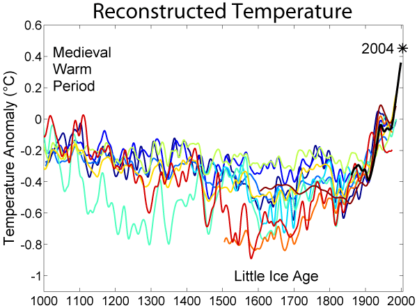 Reconstructions of Northern Hemisphere temperatures for the last 1,000 years according to various older articles (bluish lines), newer articles (reddish lines), and instrumental record (black line)
(To continue click)
3. first page, 4th paragraph and Figure 2. There are two significant problems with Figure 2 and the related text. First, the figure shows the yearly consumption rates of fossil fuels rather than the cumulative quantity consumed, which would be more representative of the greenhouse-gas forcing. In addition, a linear trend in glacier shortening may actually imply a non-linear trend in temperatures – as glaciers recede, the terminus usually moves upslope to higher altitudes (which usually have lower temperatures). If Robinson et al. (2007) were being honest about the science they would be plotting global temperature instead of “glacier shortening.”
---------------------------------------
 Figure 2: Average length of 169 glaciers from 1700 to 2000 (4). The principal source of melt energy is solar radiation. Variations in glacier mass and length are primarily due to temperature and precipitation (5,6). This melting trend lags the temperature in crease by about 20 years, so it predates the 6-fold in crease in hydrocarbon use (7) even more than shown in the figure. Hydrocarbon use could not have caused this shortening trend.
--------------------------------------
first page, 4th paragraph. “Shortening lags temperature by about 20 years, so the current warming trend began in about 1800.” No reference is given for this statement and it’s not clear why this should be true.
4. first page, 5th paragraph and Figure 3. There are several problems with this graph. Why is only the Arctic temperature plotted along with total solar irradiance (TSI)? Shouldn’t the global temperature be used instead? And on what basis is the TSI scale adjusted to create the apparent match between Arctic temperatures and TSI? It appears as though the scales were adjusted “by eye” and there is not a physical basis for selection of the axis scales.
--------------------------------------------
 Figure 3: Arctic surface air temperature compared with total solar irradiance as measured by sun spot cycle amplitude, sunspot cycle length, solar equatorial rotation rate, fraction of penumbral spots, and decay rate of the 11-year sunspot cycle (8,9). Solar irradiance correlates well with Arctic temperature, while hydrocarbon use (7) does not correlate.
--------------------------------------------
Also, again we have “hydrocarbon use” plotted rather than cumulative carbon emissions. Finally, note that TSI data after the year 2000 are not included. Perhaps this is because the TSI went down while Arctic temperatures continued to increase. Basically there has been no secular change in TSI since 1980, but global temperatures have risen significantly (see, for example the pmod TSI reconstruction.
Also, the source of the TSI data is apparently one of the authors (Soon) rather than one of the more widely accepted TSI reconstructions. See Figure 2.17 in the IPCC WG1, which provides the TSI reconstructions of Lean (2000) and Wang et al. (2005). These more accepted reconstructions show considerably less 20th century variation than does Soon’s reconstruction.
------------------------------------------
 Figure 2.17. Reconstructions of the total solar irradiance time series starting as early as 1600. The upper envelope of the shaded regions shows irradiance variations arising from the 11-year activity cycle. The lower envelope is the total irradiance reconstructed by Lean (2000), in which the long-term trend was inferred from brightness changes in Sun-like stars. In comparison, the recent reconstruction of Y. Wang et al. (2005) is based on solar considerations alone, using a flux transport model to simulate the long-term evolution of the closed flux that generates bright faculae.
------------------------------------------
5. second page, Figure 4. Again, why not use global temperatures? Why are the U.S. temperatures of so much interest here?
----------------------------------------
 Figure 4: Annual mean surface temperatures in the contiguous United States between 1880 and 2006 (10). The slope of the least-squares trend line for this 127-year re cord is 0.5 ºC per century.
----------------------------------------
6. second page, first paragraph. The claim is made that Figure 1 (see above) is “illustrative of most geographical locations,” but no reference is given. Further, there have been about a dozen groups that have created long-term temperature proxies reconstructing the northern hemisphere temperatures and the variability observed is not as great as shown in Figure 1 which applies only to the Sargasso Sea. See Figure 6.10 in the IPCC WG1 report
---------------------------------------------------
 Figure 6.10. Records of NH temperature variation during the last 1.3 kyr. (a) Annual mean instrumental temperature records, identified in Table 6.1. (b) Reconstructions using multiple climate proxy records, identified in Table 6.1, including three records (JBB..1998, MBH..1999 and BOS..2001) shown in the TAR, and the HadCRUT2v instrumental temperature record in black. (c) Overlap of the published multi-decadal time scale uncertainty ranges of all temperature reconstructions identified in Table 6.1 (except for RMO..2005 and PS2004), with temperatures within ±1 standard error (SE) of a reconstruction ‘scoring’ 10%, and regions within the 5 to 95% range ‘scoring’ 5% (the maximum 100% is obtained only for temperatures that fall within ±1 SE of all 10 reconstructions). The HadCRUT2v instrumental temperature record is shown in black. All series have been smoothed with a Gaussian-weighted fi lter to remove fluctuations on time scales less than 30 years; smoothed values are obtained up to both ends of each record by extending the records with the mean of the adjacent existing values. All temperatures represent anomalies (°C) from the 1961 to 1990 mean. (click to enlarge)
---------------------------------------------------
7. second page, first paragraph. The last sentence claims that the “Medieval Climate Optimum” was about 1 oC hotter than the current temperature. To support this claim, a paper in Energy and Environment is cited. This is a “science advocacy” journal that, like JPANDS, exists principally to publish “skeptical” research that can’t make it through peer review in the mainstream science journals. The claim that the Medieval Warm Period (MWP) was warmer than present cannot be supported by the science. See the NAS report examining Mann et al.’s “hockey stick” work.
8. second page 2nd paragraph and Figure 5. “Recovery” from the “Little Ice Age” is not a concept that has any scientific basis. It presumes there is some temperature that the Earth “likes” to be at and, therefore, “recovers” from periods that are too hot or too cold. In reality, changes in global temperature are driven by changes in various cooling and heating effects. In this instance, changes in solar activity and volcanism resulted in increased temperatures in the early 20th century. See Figure 2.18 in the IPCC WG1 report, which shows reduced volcanism in the early 20th century compared with the 19th century.
-----------------------------------------------
 Figure 2.18. Visible (wavelength 0.55 μm) optical depth estimates of stratospheric sulphate
aerosols formed in the aftermath of explosive volcanic eruptions that occurred between 1860 and 2000. Results are shown from two different data sets that have been used in recent climate model integrations. Note that the Ammann et al. (2003) data begins in 1890.
----------------------------------------------
And again, we have the U.S. temperatures compared with TSI rather than global temperatures. Why is that? Note that in Figure 5, the data for the more recent reduction in TSI (as part of the solar cycle) are included.
---------------------------------------------
 Figure 5: U.S. surface temperature from Figure 4 as compared with total solar irradiance (19) from Figure 3.
-------------------------------------------------------
Most interesting, though, is the fact that the “scaling factor” applied to the temperature axis on the graph is different from the factor applied in Figure 3. In both cases, it appears the temperature axis scale was adjusted to obtain the best-looking match between the temperature data and the TSI data. Nowhere is there any discussion of how the appropriate scale factor was determined (I suspect it was simply “by eye”), nor is there any admission of the fact they are using a different scaling relationship in Figure 5 than they are in Figure 3. This isn’t a trivial difference in scale factors – the factor used in Figure 5 is more than 40% greater than the factor used in Figure 3.
9. second page, 2nd paragraph and Figure 6. The temperature change in the U.S. over the past century is compared with other temperature variations on Earth to make the observed temperature increase appear inconsequential. First, they should be using the value for increase in global temperature, which is about 1 oC over the past century rather than 0.5oC, which they get from the U.S.-only data. Second, they compare again to the reported 3oC variation in Sargasso Sea temperature from Keigwin (1996) without noting that the Sargasso Sea amounts to only about 0.001% of Earth’s surface and without noting that Keigwin estimates about a third of the 3oC variation is likely an artifact of variations in salinity, so the true Sargasso SST variation over that period is, according to Keigwin, about 2oC. Third, the appropriate point for comparison here would be the average temperature for a much larger area, such as the Northern Hemisphere. See: Figure 6.10 in the WG1 report above (paragraph 6), which shows about a 1oC variation in NH temperature over the past 1300 years.
--------------------------------------------------------
 Figure 6: Comparison between the current U.S. temperature change per century, the 3,000-year temperature range in Figure 1, seasonal and diurnal range in Oregon, and seasonal and diurnal range throughout the Earth.
-------------------------------------------------
The other two bars on the histogram (Oregon Day-Night and Seasonal Temperature Range; and Earth Day-Night & Seasonal) are truly ridiculous. The “Oregon” bar refers to the difference between the warmest daytime (Summer) temperature in Oregon (approximately +40oC) and the coldest nighttime (Winter) temperature in Oregon. Why should that temperature range serve as a valid point of comparison? If global warming was thought likely to turn the coldest part of Winter in to the hottest part of Summer, then maybe that’d be a valid comparison. It’s not.
Similarly, the “Earth Day-Night & Seasonal” bar is the difference between the hottest spot on the earth in Summer and the coldest spot on the Earth in Winter. But why stop there? Why not have a bar showing the difference in temperature between the temperature at Earth’s core (6500oC) with the temperature in central Antarctica during winter (-100oC), thereby making the U.S. Temperature increase bar look really small? I’m surprised they didn’t think of that.
10. 2nd page, 3rd paragraph. Again, we have a discussion of the 0.5 oC increase for the U.S. instead of the 1.0 oC increase for global temperatures.
Putting aside that error for the moment, Robinson et al. (2007) are claiming that solar activity increased by 0.19% since 1900 and the 0.5oC temperature change (0.21%) is somehow corroborating evidence that the temperature change is due to changes in solar activity.
First of all, the 0.19% solar intensity increase is not consistent with more reputable sources of the change in TSI over the past century (e.g., Lean (2000) and Wang et al. (2005)), which yield an estimated increase of about 0.06% since 1900).
Second, a 0.5oC temperature change amounts to 0.21% only if the “baseline” temperature is equal to 238 Kelvin, which is a rather strange baseline temperature to use since it’s about 50oC too cold.
12. 2nd page, 5th paragraph. It is probably true that most people would not notice a 0.5oC temperature increase. However, the global temperature increase (1oC) has been twice the U.S. value (0.5oC). Further, the concern is not really so much the temperature increases we’ve already experienced, but it is the temperature increases to come that are cause for concern. It’s also worth noting that there’s no reason to suppose that Earth’s climate and biospheric systems are as insensitive to temperature changes as is human skin.
13. 2nd page, 6th paragraph. It is noted that over the past century, the U.S. has experienced a slight increase in rainfall, fewer tornadoes, and no increase in “hurricane activity.” It’s not clear what these data are supposed to prove, though. First of all, the concern is global climate change – not U.S. climate change. Second, although increases in rainfall are expected for some areas, increased drought is expected in others. It’s not clear at all what the expected effect of global climate change is for tornadoes. Tornadoes are much too small to be represented in the grid structure of most climate models. There is also considerable debate as to whether hurricane frequency and/or intensity will increase as Earth warms.
Robinson et al. (2007) present the data in Figures 7, 8, 9, and 10 (not plotted here) as if it somehow was in direct contradiction to the predictions made for global warming, but they make two mistakes: (1) the data they show are for only for the U.S.; and (2) the weather events they choose to plot cannot be directly compared against predictions for a warmer world. So these graphs amount to nothing more than a school of red herrings.
14. 2nd page, 6th paragraph, sea level rise discussions. Figures 11 (not plotted here) and 12 show the changes in sea level over the past two centuries. It’s not entirely clear what point they’re trying to make by noting that the sea level rise data show “3 intermediate uptrends and 2 periods of no increase.” Actually, the periods of “no increase” are really just periods where the rate of sea level rise is somewhat reduced (but not zero). Interestingly enough, the paper Robinson et al. (2007) references for the sea level data (Jevrejeva et al. 2006) observes that the periods of reduced sea level rise rate correspond temporally to periods when volcanic activity was increased... except, that is, for the observed sea level rise since about 1980 where volcanic activity has been higher but the rate of sea level rate is still high (See Figure 6 in Jevrejeva et al. 2006).
Robinson et al. make the statement that “if this trend continues... sea level would be expected to rise about 1 foot during the next 200 years,” without noting that the principal concern with respect to global warming is that the rate of sea level rise is predicted to increase.
----------------------------------------------------
 Figure 12: Glacier shortening (4) and sea level rise (24,25). Gray area designates estimated range of error in the sea level re cord. These measurements lag air temperature increases by about 20 years. So, the trends began more than a century be fore in creases in hydrocarbon use.
----------------------------------------------------
15. 3rd page, 1st paragraph. Again, the statement is made that because the “trends” in sea level and glacier shortening appear to have begun before major increases in “hydrocarbon use,” then “hydrocarbon use” must not be the cause. This argument misses that point that there are multiple, competing factors acting on the climate including solar effects, volcanism, manmade aerosols, and greenhouse gases. To determine whether greenhouse gases are affecting the climate, it is essential to include an analysis of the other factors known to affect climate. Refer to Chapter 9 of the IPCC WG1 report for a discussion of how attribution studies are conducted in climate science.
16. 3rd page, 2nd paragraph. “Much of that CO2 increase is attributable to the 6-fold increase in human use of hydrocarbon energy.” That’s true, although it’s more accurate to say that all of the observed CO2 increase can be attributed to human activities including fossil fuel combustion and vegetation burning for land clearing. See this discussion of how we know that recent CO2 increases are due to human activities.
The claim that “Figures 2, 3, 11, 12, and 13 show human use of hydrocarbons has not caused the observed increases in temperature” is not supported by the data provided in the Robinson et al. (2007) paper for reasons already discussed.
17. 3rd page, 3rd paragraph. The claim is made here that increased CO2 concentrations have improved the “extent and diversity of plant and animal life.” No reference is given for this statement and no data are provided to support the statement.
18. 3rd page, 4th paragraph. “There are no experimental data to suggest this.” This is a rather cute bit of deceptiveness. It’s rather difficult to run experiments that involve the whole Earth ... that is, other than the uncontrolled experiment we’re already conducting by pumping greenhouse gases into the atmosphere. Contrary to the impression Robinson et al. (2007) tries to give, though, there is plenty of direct, experimental evidence demonstrating the basic physics underlying the theory that global climate change is caused by manmade greenhouse gases.
19. 3rd page, 5th paragraph. “The empirical evidence – actual measurements of Earth’s temperature and climate – shows no man-made warming trend. Indeed, during four of the seven decades since 1940 when average CO2 levels steadily increased, U.S. average temperatures were actually decreasing.” Here we go again with U.S. temperatures. The concern here is global warming. Further, it’s clear that Robinson et al. are confused about how attribution studies need to be conducted. It takes more than just plotting U.S. temperature along with “hydrocarbon use” on the same graph to determine the fraction of temperature change that can be attributed to human activities.
Also, “...and humans have been responsible for part of this increase...” is misleading. Human activities quite clearly account for all of the observed increase in atmospheric CO2 concentrations over the past century.
20. 3rd page, 6th through 9th paragraphs. This is all opinion and wild speculation with no evidence, references, or science to back it up. No further comment is necessary.
21. 4th page, 1st paragraph. Same comment as 20.
ATMOSPHERIC AND SURFACE TEMPERATURES
22. 4th page, 2nd and 3rd paragraphs. The Sargasso Sea temperature cannot be said to be representative of global (or even hemispheric) temperatures. The idea that the Earth would “rebound” from a cold period such as the Little Ice Age is unsupportable. Changes in global temperature are principally attributable to changes in forcings (solar, volcanic, greenhouse gases, etc.). The Earth went into the Little Ice Age cold period (to whatever extent it was a global phenomenon) because of changes in solar and volcanic forcing.
23. 4th page, 4th paragraph. It is stated that “temperatures have been higher than they are now during much of the last three millennia.” However, no reference is given to support that statement. Sargasso Sea temperature measurements cannot be used to support the claim that global temperatures have been higher in the past few millennia. Further, the argument that the “historical record does not contain any report of ‘global warming’ catastrophes” is off the mark. First of all, historical records do show that climate changes contributed to the demise of societies throughout history (see Collapse by Jared Diamond). Second, the principal concern with global warming is the increasing global temperature expected to occur in coming decades, so comparing today’s global temperatures to past temperatures isn’t terribly appropriate. Instead, we should compare past temperatures to the approximately 2oC higher temperatures expected in the coming century. If we do that, we find that the last time global temperatures reached that level was approximately 3 million years ago. And at that time, sea level was about 25 to 35 meters higher than present. Undoubtedly there were many other regional climate differences as well.
24. 4th page, 5th paragraph. It is stated that “The 3,000-year range of temperatures in the Sargasso Sea is typical of most places.” but no citation is given for this statement. Further, it’s not clear what this statement is supposed to mean. The remainder of this paragraph attempts to make the argument that “individual records” are more meaningful than hemispheric or global averages. That is a rather strange argument to make given that the concern here is global warming. The Essex et al. (2007) paper that is cited in support of this argument is, in my opinion, just a cute bit of sophistry. Their argument is that it’s inappropriate to try to compute an “average” temperature of a system as complicated as the Earth’s climate. Their argument basically comes down to the point that averages tend to obscure the details of the variations within the system. Sure, that’s true, but that’s exactly the point of taking an average of a complicated system – it helps us to see the forest instead of getting distracted by the multitude of trees.
25. 4th page, 6th paragraph and Table 1. This paragraph discusses the results of an analysis by Soon et al. (2003) that was published in the Energy & Environment, which is a well-known “journal” that seems to exist principally to publish “skeptical” articles. In this case, the Soon et al. article was soundly debunked by several groups. Here are two critical reviews, the first in Science, by Raymond Bradley, Malcolm Hughes and Henry Diaz, and the second a statement from the AGU.
26. 4th page, 7th paragraph. It is claimed here that “mean and median world temperatures in 2006 were, on average, approximately 1oC to 2oC cooler than in the Medieval Period.” To back up this statement, they reference a Web page. That’s not exactly peer-reviewed science in a reputable journal. In addition, the authors of this “paper” (Idso and Idso) are well-known global-warming “skeptics” with ties to the fossil fuel industries.
27. 4th page, 8th paragraph. Other than the use of the phrase “cycle of recovery,” which is intended to again imply the misleading notion of a “recovery” from the Little Ice Age, this paragraph is largely accurate.
28. 4th page, 9th paragraph. This paragraph is a restatement of arguments made earlier in the paper.
.....
There are, of course, many more errors and distortions in the Robinson et al. (2007) paper, but there comes a point when enough should be enough. The errors described above should be sufficient evidence for any fair-minded person to conclude Robinson et al. (2007) is not a serious scientific paper. Instead, it appears to be nothing more than a clumsy attempt to distort the evidence for anthropogenic global warming in order to sow confusion in the minds of people not already familiar with the evidence.
Mike Powell
PE, MS Chemical Engineering
Kennewick, Washington


6 comments:
Egads , Eli- Has wee Willy Soon backed into a proxy for the palaeoalbedo variation of the Sargasso Sea ?
As is noted above , "the Sargasso Sea area of 2 million sq. miles amounts to only 0.0011% of the Earth’s surface area. That’s a rather small fraction and it’s unlikely that temperature variations in such a small region provide a direct measure of the magnitude of global temperature variations."
Despite being famously weedy , the Sargasso is noted for its water clarity- the weed competes with other , mirkier phytoplankton. and if the ocean water was warmer than global average, something may have been happening to the near surface albedo
I really want to know where Soon came up with that TSI wiggle. Does anybody have a digital copy of it? Has anybody read the original source? Does it compare remotely to the measured TSI over the instrumental period?
Please check the 0.0011% figure in your text below:
QUOTE
"Note that the Sargasso Sea area of 2 million sq. miles amounts to only 0.0011% of the Earth’s surface area. That’s a rather small fraction and it’s unlikely that temperature variations in such a small region provide a direct measure of the magnitude of global temperature variations."
UNQUOTE
I understand that the earth surface in sq. miles is just below 200 million; if the Sargasso's area is 2 million sq. miles, it represents 1% of the surface of the earth, not 0.0011%.
Ugh!
Anonymous is right -- the 0.0011% number is wrong. The correct number is about 1%. I'm not sure how I messed that up, but I did!
For what it's worth, though, Keigwin's paper reported the estimated sea surface temperature based on isotopic analysis of foraminifera from a core sample taken from a single location in the Sargasso Sea (i.e., the Bermuda Rise). It's perhaps a bit of a stretch to assume this single core sample provides representative temperature data for the whole of the Sargasso Sea.
Robinson, Robinson, and Soon are going even further with it, though. They are using the temperature estimated from this single core sample to illustrate the temperature of the entire planet over the past 3000 years.
Eli, I'd appreciate it if you would correct the 0.0011% value to 1%. Thanks.
My pleasure Mike
I'm afraid you have a couple of "nice" people trolling for traffic, not relevant.
Post a Comment