It's the Effing Details

So what's new? Well the Weasel is going after a sci-fi comic drawing in the H.H. Lamb series, this one first appears to have appeared 2006 in the Torygraph in an article by the Monkers (don't blame Eli, that was Wm's description) part of which was reproduced as part of an amazing mathterbation exercise by David Evans over at Nova's. More on that next post.
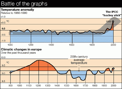
and since republished here and there. Wm wants to know where this came from. Whatever it is it is not the from the IPCC First Assessment Report (FAR), but somebunny's "modification" of same for Europe.
What was in the IPCC FAR was a free hand sketch by H.H. Lamb that has since been abused every which way, as described by the Weasel and others)

So when Christopher Monckton claims that in an article showing the first graph that
The UN's second assessment report, in 1996, showed a 1,000-year graph demonstrating that temperature in the Middle Ages was warmer than today.
He is wrong about which IPCC assessment report had the Lamb sketch, and wrong that the graph that appeared in the bottom pane of the figure shown in his piece was the one that appeared in the IPCC report and wrong when he said the graph demonstrated that the temperature in the Middle Ages was warmer than today, because, well, because of Mike's trick. Eli is a helpful little bunny, so he hopped over to Wood for Trees, ran a graph of HADCRUT 4 global and smoothed it on a ten year basis, ran a line over the global temperature variation and nailed it to the 1900 value shown in the first graph above, voila, Mike's trick.

The fun thing is that Chris Monckton is running about Sgt. Schultzing that he knows nothing, nothing about that graph.
Mr Connolley falsely accuses me of having fabricated a graph in whose selection, drafting and publication I played no part whatsoever. I should be grateful if he would remove all references to my having “faked” or fabricated this graph, and if he would kindly notify me when he has done so.and being met with an OK, who put it into an article you wrote and had published and have you written to the Telegraph asking them to post an error notice. Eli notes that in 2008 Monckton got the IPCC report version right, and the curve, but somehow erased the y axis and did not note how the instrumental record sort of falsifies the Lamb sketch.


7 comments:
I think a slow clap is in order here.
My model (Ouija Board, Rev 2.1) predicts that you're blog will be threatened with a libel suit.
"don't blame Eli" is not going to absolve you :)
Note also the falsification of the first graph, which shows a horizontal shaft, as did Montford's 201 book The Hockey Stick Illusion.
MBH99 had a clear sloped regression line.
Well John, England is in Europe, at least for the moment, however the figure in question has some interesting differences with the one in the 1990 FAR . . .
Of course it has interesting differences, as do the myriads of versions and copies of versions. I've found ~10 just in books.
One can argue whether or not England really is in Europe, :-) but Central England certainly is not equal to Europe, and it is likely to be more subject to North Atlantic jiggles than most of Europe.
Eli may wish to inquire of VisionLearning why this page - that used the 'Battle of the Graphs' image as an example of 'Misuse of scientific images' and attributed it to Monckton's Telegraph article was changed in the past day omittimg the 'Misuse of Scientific Images' section.
I suspect our dear peer has a hand in the matter.
According to Monckton, although apparently his champion Watts disagrees since he found them worthy of nearly censuring Monckton, the graphs are "blameless," "harmless schematics." "So I,” says Monckton, “am going to court. My lawyers say the libels are plain and indefensible. They comment additionally that no judge would regard the schematics in the Telegraph (whoever had drawn them) as significantly misrepresenting the difference between the 1990 and 2001 reports’ images of the past millennium’s global temperature anomalies. As far as they can see, there is not a lot wrong with the graphs in any event."
No, there is not a lot wrong with the graphs, except as Monckton relates, for example, "With the article I supplied some background material for Telegraph readers on its website. In that material, the IPCC’s 1990 graph also appeared, mistakenly captioned as 1996 rather than 1990." Or that they artistically compare a schematic of temperatures in "central Europe" with a schematic of temperatures in the "northern hemisphere," while Monckton claims they fairly represent the IPCC's "1990 and 2001 reports’ images of the past millennium’s global temperature anomalies" [emphasis added]. Not to mention all the rest of the ridiculous assertions in his Telegraph piece and subsequent statements.
As a defender of "true science" and "skepticism" against the global conspiracy of climate scientists, Monckton isn't shy to admit that he holds his father's dowsing skills in high esteem; in fact he seems compelled to relate his late father's dowsing story despite its marginal relevance to the allegations he's defending himself against. He uses it as an example of the unfairness of his and other pseudo-skeptics' mistreatment by the global climate conspiracists.
Taylor B
Post a Comment