Even more obvious once you think about it


Eli has read the comments, thought about it a bit more and added another line to the Sea Ice Area graph, showing the maximum amount of new, first year ice formed, the red line above. This is simply the difference between the maximum amount of sea ice in a year less the minimum amount of sea ice area in the preceding Fall.
The amount of first year ice, if anything, is INCREASING. How could that be? To understand this we need to look at Jeff Condon's measure of ice south of 72o North
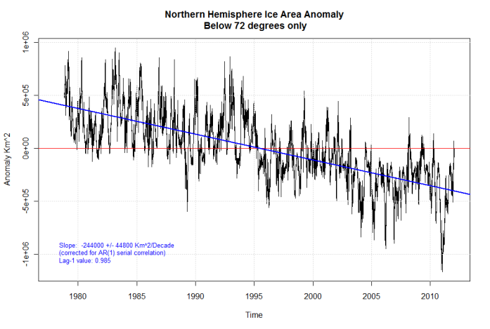
which is decreasing.
Taken together, a consistent story of sea ice in the Arctic emerges:
1. The area covered by more than one year old ice is decreasing significantly from about 5 million sq km in 1980 to about 3 million km2 now. That is a decrease of 40% in 32 years.
2. The total amount of first year ice south of 72o North has decreased by about 0.75 million km2 in the same period. Condon mentions that there is an average of about 4 million km2 that far south at maximum extent over the 32 years, so this is a decrease of about 20% (Eli is playing horseshoes here, looking for meaning not misleading statistics). Most of this decrease is in areas such a the Baltic, the Sea of Okhotsk and the Bering, Greenland and Barents Seas. So far Hudson's Bay freezes completely over.
3. The ~1.25 million km2 (Rabett eyeball) increase in total first year ice area is entirely from filling the Arctic basin.
4. Summers with major melting are followed by large increases in first year ice from this filling in.
5. The ice pack south of 72o North has both regions which are connected to the Arctic (Greenland, Bering and Barents Seas) and disjoint from it (Hudson's Bay, the Baltic, the Sea of Okhotsk). The former will contribute less in years following significant summer melt which reduces the size of the pack, the latter are sensitive only to local temperatures. A better analysis would exclude the disjoint areas. Eli will have a drink, thank you very much. With ice.


6 comments:
Back in 2004, the esteemed scientist F. the Singer said in his book that the Arctic ice will not melt anymore. So your chart must be hooey.
Snow Bunny says:
The above comment is mine. In case any bunnies flip out, I should add that it comes from my sense of sarcasm.
Once the Arctic melts completely, all of the ice will be 1st year ice.
A large amount of 1st year ice isn't good.
Well, this is worth a giggle (Steven usually is): http://junkscience.com/2012/03/11/steven-goddard-arctic-fraud-worse-than-it-seems/
I love the red circles, especially the high point, which is in 1978, not 1979!
1) As I posted to the other comments, I think the red line is actually the lower bound on first year ice (as some older ice will continue to melt/be exported in the month or two after the minimum).
2) Yes, as the quantity of older ice decreases, if peak winter ice doesn't change*, then first year ice will naturally increase over time.
*Of course, we do expect peak winter ice to decrease too, but because of geographic constraints** and fewer positive feedbacks, we expect this to decrease more slowly than minimum summer ice.
**Look at a map of winter ice. There's a lot of land at the lowest latitudes. If the Arctic was pure open ocean, such that the ice cap was roughly circular at all times, I might expect more winter ice retreat by area because a given degree of retreat would leave behind a lot of open water. But now, a given degree of retreat doesn't do as much. But I haven't done the climate modeling calculations to see how my instincts match up... and again, there's the positive feedback question which is when the sun is up in the summer, more retreat leads to more retreat, but in the winter, more retreat actually leads to more heat loss... interesting hypotheticals, I really do kind of want my home-climate-model to test this out on...
-MMM
If you look at the video, the melt after the minimum is not very much. MMM is correct, but probably there is only a small numerical effect.
As a zeroth or even first order guess with little work the figure is very useful.
Post a Comment