Melting hopes

This means that the West Antarctic Ice Sheet is subject to even more stress than previously thought, and is much more in danger of collapse than previously thought, which already was causing premature hare whitening.
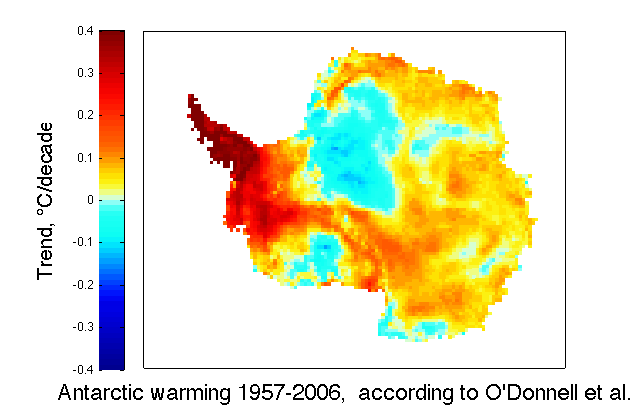
If that ain't bad enough, O'Donnell et al.'s results say that the coast of East Antarctica is warming even faster than Steig, et al. deduced, so that situation is also worse. It doesn't much matter if ice warms , but stays frozen, but it matters a hell of a lot if it warms and melts, or even warms and weakens. Melting and weakening in Antarctica occurs mostly at the margins and not in the interior, and what interior melting occurs, refreezes before it can contribute to sea level rise, while melting and weakening on the edge of the continent, contributes directly and immediately to sea level rise.
There also appears to be some differences between the maps at Real Climate and Climate Audit, both for O'Donnell, et al., and Steig, et al., but the bottom line is the same not matter which versions you use.


63 comments:
Eli
O’Donnell wrote a guest post at the Air Vent.
http://noconsensus.wordpress.com/2010/12/01/doing-it-ourselves/
Brian
I think the main difference is that the RC version is much lower resolution (it has a bad case of the 'jaggies'). Nothing real funny going on.
Rattus, in this case, if anything, the jaggies are a sign of higher resolution, in which case McIntyre is trying to wash out the local maxima (and minima)
Now I wouldn't trust McIntyre as far as I could throw him (and since I have a bad back, that ain't very far!) but in this case I think he was being honest. Now as to the actual content of the lying sack of shit's post...
Eli -- "Rattus, in this case, if anything, the jaggies are a sign of higher resolution, in which case McIntyre is trying to wash out the local maxima (and minima)"
Actually, in the McI version the red densities are very different to the RC version, and also has a lot of white in it (no change in temp). The McIntyre version's the one that's been doing the rounds, and it seems to give a completely different account of cooling to the RC version. I was quite taken aback as I've been having a few ding-dongs already over it at the Grauniad. Wish I'd seen the RC version sooner.
This is Eric Steig's explanation for the RC map:
[The figure here shows O'Donnell's et al.s reconstruction for the same time period as our Nature cover image. These are annual mean estimates. I cannot speak to WTF WUWT has done.--eric]
"The Pine Island Glacier (PIG) transports 69 cubic kilometers of ice each year from ~10% of the West Antarctic Ice Sheet (WAIS). It is possible that a retreat of the PIG may accelerate ice discharge from the WAIS interior...The grounded PIG thinned by up to 1.6 meters per year between 1992 and 1999, affecting 150 km of the inland glacier..." Shepherd etal(2001)
"Thinning ice in West Antarctica, resulting from acceleration in the flow of outlet glaciers is at present contributing about 10% of the observed sea level rise. Pine Island Glacier in particular has shown nearly continuous acceleration and thinning, throughout the short observational record. The floating ice shelf that forms where the glacier reaches the coast has been thinning rapidly, driven by changes in ocean heat transport beneath it..." Jenkins etal(2010)
"Thwaites Glacier is an unusually broad and fast Antarctic glacier flowing into Pine Island Bay..." (Wikipedia) It is also ~10% of the area of WAIS, and is located west of the PIG.
Both are in the red on the above map. On the CA map, the Thwaites glacier is not in the red.
It is my understanding that the reconstruction methodology/technique is designed to estimate temperatures using the satellite data, so the image should be high resolution, with the temperature data having the same resolution the satellite data/pixels. The AVHRR satellite data from the NOAA satellites are fairly high resolution, although i am not sure exactly what. 1-km comes to mind.
Anyhow, the RC graph makes more sense, as the detail is consistent with the satellite data used to generate it. Smoothing the data potentially removes valuable information.
I'm confused and do not trust McI or WUWT. Does anyone have access to the graphs as they appear in the paper? I went to the AMS site and the paper was not available yet, even here:
http://journals.ametsoc.org/toc/clim/0/0
Someone really needs to clear this all up and fast.
That all aside. Yikes indeed Eli!!
MapleLeaf
I think that when considering this paper it is important to make note of several things. Firstly, the rate of warmth in West Antarctica is largely unimportant to a point. The Antarctic Peninsula is a different beast altogether than the West Antarctic Ice Sheet. West Antarctica is for the most part too cold to sustain surface melting therefore the vast majority of ice loss occurs through basal melting and glacier acceleration. The key mechanism at play there is that warming waters are causing grounding lines to migrate inland resulting in reduced backpressure and subsequent glacier acceleration and inland thinning. This process will be largely unaffected by the surface air temperatures.
Where there is perhaps some importance is that we could see reductions in sea ice around West Antarctica and therefore ice shelves are left more susceptible to break ups (as well as reduced friction on glaciers from less sea ice).
The Antarctic peninsula is different however. It is one of the fastest warming places on the planet and it sees significant surface melt occurring on glaciers and more importantly on ice shelves. The ice shelf fracture mechanism observed on Larsen B involves pooling of meltwater migrating to through the shelf and thereby forcing catastrophic break ups very quickly. This is a grave concern as ice shelves increase the amount of backpressure on glaciers thereby making their collapse result in reductions in backpressure and subsequent accelerations. Larsen C and the remainder of the Wilkins ice shelf are seen to be right now on the fringe of the southward migration of ice shelf collapses and it would be unsurprising to see that trend continue in the future given O'donnell's results.
Sorry if this comment is long.
WTF are the Chladni patterns that McIntyre is crying about, that he couldn't get them in the paper. My BS detector thinks they did him a favor in keeping them out.
Anon(1)
Robert Way, Sorry for Eli's lack of precision. In that both of us think that the thing that is important is the area of (highest) warming at the margin of the continent, we agree. As you say: "Where there is perhaps some importance is that we could see reductions in sea ice around West Antarctica and therefore ice shelves are left more susceptible to break ups (as well as reduced friction on glaciers from less sea ice)."
Frankly, Rabett Institute of Glaciology (only wild assed guesses allowed) does not think that very much happening in the interior of Antarctica (and that is everything except maybe a hundred km from the shoreline) will have much effect on sea level rise or much else within the next couple of centuries, given the thickness of the ice sheet.
Oh yes, Robert, Rabett Run favors long intelligent comments whether they agree with the owner-operator or not.
This most recent paper is in agreement with other findings (data from the handy website of Sato and Hansen) that
(1) the area of sea ice in Antarctica shows no clear trend, up or down,
http://www.columbia.edu/~mhs119/SeaIceArea/
and (2) the mass of ice in Antarctica is decreasing.
http://www.columbia.edu/~mhs119/IceSheet/
-John Farley, Prof. of Physics,
Univ. Nevada, Las Vegas
Little Mouse is glad his mouse house is 200 feet above sea level. So we have
The uncorking effect, loosing the ice shelves mean that back pressure is reduced.
Accelerated glacier movement means more acceleration, faster thinner faster thinner gone
Unstable grounding lines in the PIG TW. If it backs up over the lip then the grounding line will retreat rapidly.
The sub-glacial lakes are quite active in moving water around, giving greater lubrication(Fricker HA; she found one, then lots of active lakes, then that water movement affects glacial flow).
Termination melt where because of the angle of the sun ice shelves melt most rapidly on the edges, then the interior edge where the shelf meets land and then Oh yes next upward tilted surfaces are the slopes of the Trans Antarctic Mountains.
If we fix the hole in the ozone layer then circumpolar currents and winds might change.
Did I miss anything?
Little Mouse better move to higher ground.
Eli,
If you look at Figure 3 in my URL you will see the regions in East and West Antarctica that are seeing large ice losses (I did not include the peninsula). If you compare these patterns to the results from O'Donnell et al (2010) you will find it to show that most regions I outlined are covered at least partially by red. Now of course it is too cold to have melting in any of these regions but it does not bode well for the future...
Regarding
"(and that is everything except maybe a hundred km from the shoreline) will have much effect on sea level rise or much else within the next couple of centuries"
I think that its important to note that glacier accelerations can be felt deep inland on large drainage basins. This has been established by work with radar interferometry (can't think of the study name) in Pine Island Bay if I recall. Certainly much of the deep inland portions of East Antarctica are negligible for sea level rise but if you look at Figure 5 in the URL you should notice that any land surface in Grey is a region that is grounded below sea level. Where this occurs there is the potential for deep inland propagation of glacier accelerations. Most of the West is under sea level making it very susceptible but it should be noted that Cook glacier and Totten glacier in the East are in similar regions therefore warranting some concern.
They are both currently established to be losing ice but not substantially. The Potential however exists with polar amplification that enough warming could occur to make these regions even de-stablize.
PS,
I actually don’t know why the skeptics are clamoring to this. I find it looks scarier than the original personally.
Robert Way, the 'skeptics' are clamoring this, because it attacks "the Team". And anything that attacks "the Team" can then be used to discredit "the Team". And since "the Team" is considered (by the 'skeptics') to be the only group of scientists publishing the dire warnings, these dire warnings can be dismissed. Regardless of what the results in the paper by O'Donnell indicate about the direction of our climate. Doublethink is a strong trait in the 'skeptic' mind.
Meanwhile, up North...
Science Daily: Greenland Ice Sheet Flow Driven by Short-Term Weather Extremes, Not Gradual Warming, Research Reveals.
http://www.sciencedaily.com/releases/2010/12/101208172318.htm
Lost in all this is that the majority of ice loss on both ice sheets stems from warming ocean water and grounding line retreats...
Leaving aside the scared-ness about the planet drowning, which picture is the more likely to be true? I mean if I could get a time machine, go back and plant thermometers and actually draw the map AS IT HAPPENED, whose picture is it more likely to be close to? The team? Or the counter-team?
I know this totally annoys both sides, but I find myself very able to just wonder about the math and science and disassociate it from the human impact and policy debate issues...
"Robert Way, the 'skeptics' are clamoring this, because it attacks "the Team". And anything that attacks "the Team" can then be used to discredit "the Team". "
100% Correct. It's McIntyre's magic reframing of the debate from a matter of science to a matter of a small group of bad people vs McIntyre, the hero. If you read between the lines, even some of his closest friends now question that way of looking at the issue. They don't want this cast into a battle of good against evil, but as science vs anti-science. By publishing a paper themselves, they are coming to appreciate just who much hard work it takes, for what is relatively little reward.
Anon(1)
But I still want to know about the Chladmi patterns. They seem to be very important to McI, while constituting very little in the way of science.
Anon(1)
"Chladni patterns" I think are Steve's unique* terminology for what are commonly (in atmospheric sciences) known as "Buell patterns".
* google and google scholar give nothing of relevance for chladni+patterns+principal+components+analysis
For a brief explanation of Buell patterns, see...
Wilks, Daniel S. Statistical Methods in the Atmospheric Sciences, Volume 100, Second Edition. Academic Press, 2005.
... and google turns up plenty of hits.
This is a piece of irony then. Googling Buell brings up McIntyre himself.
http://climateaudit.org/2009/02/26/buell-castles-in-the-clouds/
"Like so many other elements of meteorology and climatology, though, modern climate science appears to have forgotten some important statistical insights produced by it’s own practitioners . . . indeed, some of the practitioners themselves appear to have forgotten what they wrote."
McIntyre has indeed forgotten what he wrote, and called the Chladni patterns in the paper that was first submitted.
Anon(1)
I put this comment on Ryan O'Donnell's post at Air Vent:
Has anyone looked at what portion of the continent has statistically meaningful warming, versus statistical meaningful cooling? If I recall, the decadal trends are accurate to roughly +/-0.1 deg C.
It appears from the maps at the Eli Rabett link, that O'Donnell found statistically meaningful warming in about 30% of East Antarctica, with less than 5% showing meaningful cooling. The previous paper by Steig had far less resolution, and showed less than 5% of East Antarctica showing meaningful warming (with the rest of the area not showing any meaningful warming or cooling trends).
In West Antarctica, both the O'Donnell paper and previous work by Steig show statistical warming over 70% of the area, but the O'Donnell paper shows much warmer anomalies across much of West Antarctica, particularly the Antarctic Peninsula. O'Donnell shows most of the Peninsula warming over 0.4 deg C per decade.
So the lead paragraphs in an accurate news article on the O'Donnell paper would read something like this:
NEW STUDY SHOWS SIGNIFICANT WARMING OVER MUCH OF ANTARCTICA
A new paper published in the highly regarded Journal of Climate shows statistically significant warming in over 70% of West Antarctica, consistent with a previous study. However, the new study shows much higher warming throughout the Antarctic Peninsula than the previous work showed. West Antarctica has some of the most threatened ice sheets, glaciers, and ice shelves on the continent.
The new study also shows significant warming over 30% of the much larger East Antarctica ice sheet, whereas previous studies showed no statistically significant warming. In contrast, less than 5% of East Antarctica showed significant cooling, inconsistent with some forecasts expecting significant cooling due to effects from the ozone hole over the South Pole.
Is this a reasonable summary of the new results?
zinfan94
From Vernon:
Why do you have the graphics using different scales? This makes it impossible to to look at the graphics and make any visual comparison. When you look at the actual differences stand out:
___O10___________S09
0.06 +/- 0.08___0.12 +/- 0.09__Continent
0.03 +/- 0.09___0.10 =/- 0.07__East Antarctica
0.10 +/- 0.09___0.20 +/- 0.09__West Antarctica
0.35 +/- 0.11___0.13 +/- 0.05__Peninsula
This tells a very different story. S09 was important because it showed statically significant warming over all of Antarctica while O10 shows no significant warming on the continent as a whole. S09 shows the major warming was in WA which has been shown to not be the case in O10. It tells a different story when you do an apples to apples comparison.
Vernon, the issue as Eli sees it is that O10 shows most of the warming on the coast and cooling mostly inland Since sea level rise is controlled by what falls off the coast. . . .
Vernon, the critics of the Steig paper claimed that areas of the map that showed between -0.1 and +0.1 deg C couldn't be considered as either warming or cooling. Consider using their own metric, and paint the maps above white (for no significant trend) wherever the yellow and light blue appears. The remaining orange and dark blue areas are the only areas where significant warming or cooling has occurred.
The O'Donnell paper claims that by using different statistical methods they can obtain a higher resolution between cooling stations and warming stations, and their map above clearly shows that. In West Antarctica, the majority of the area warmed over 0.1 deg C, with a minority area cooling/warming less than 0.1 deg C, and only one tiny dark blue dot showing significant cooling. Averaging the warm area with the cool area loses some of the clearly significant results. Most of West Antarctica is experiencing a statistically significant warming trend, using the metric the Steig critics used.
In the same way, most of East Antarctica doesn't show significant warming or cooling, but about 30% of the area does show a warming trend greater than 0.1 deg C, and there are some dark blue areas that show significant cooling trends (my guestimate is about 5% of WA).
It would be illuminating to see the data parsed to the show the area of Antarctica that falls into the temperature anomaly ranges, that the Steig critics themselves suggested and used, and then apply these ranges to the higher resolution map from the O'Donnell paper. Overall, the data seems to clearly show a significant warming trend across much of Antarctica, much of the continent neither cooling or warming, and with only a small area of EA cooling.
zinfan94
Could someone with the data and tools puhleeeaze plot these two temperature maps displaying isobars (contour lines) instead of color shading?
It ought to be possible to overlay the two and blink them, or otherwise do a simple straight visual comparison?
________________________________
"ow dif" says Captcha, agreeably
From Vernon:
I think Hank's idea is excellent. Per what the authors are saying, the SI should have everything needed. Additionally, Ryan O said that they used the .5 so that the yellow indicates where the warming is statistically significant per his post to Eric on RC. I would suggest that be used at the range in this effort if it goes forward.
Zinfan94 (aka Paul K2 @RC),
Ryan O has posted this response and graphic over at TAV.
"Re-created image for the RLS reconstruction, 1957 – 2006, with areas of statistically insignificant trends overlaid in gray:
http://img697.imageshack.us/img697/7476/statsigd.png
Also left a comment at RC. In moderation."
http://noconsensus.wordpress.com/2010/12/10/olmc-10-what-does-it-mean/#comment-43051
He also replied to you at RC with the same graphic.
http://www.realclimate.org/?comments_popup=5606
I fail to see statistically significant warming across Antartica.
Celery Eater
The different maps are a) the published peer reviewed map used by WUWT and b) a novel map made by real climate utilizing a more blurred color scheme that is honestly much more impressive than the usual teal-white-orange.
From Vernon:
Well unless Eric can find something wrong with O10, and based on his comments from the pre-print, he has not. Then other than the peninsula and a small amount to adjacent WA, there is almost no significant warming or cooling in the Antarctic. That is a refutation of S09 which found significant warming over the entire continent.
I am not going to speculate on motive but it appears that the change in scale done by RC rather than use the actual graphics that were in the pre-print is misleading. That the worries of coastal warming are at this time unfounded for most the continent.
O'Donnell et al 2010 paper is at
http://www.climateaudit.info/data/odonnell/SI%20Revised%208-12-10.pdf
Celery Eater:
"I fail to see statistically significant warming across Antartica."
Ryan O, on the other hand, says:
"Statistically significant warming in our study is restricted to approximately 33% of West Antarctica (not 70%) for the RLS reconstructions, and slightly less for the E-W reconstructions. Statistically significant warming is restricted to approximately 5% of East Antarctica (not 30%) for both reconstruction methods.
Your guess concerning areas of statistically significant cooling were far closer to the mark. The RLS reconstruction method yields < 1% of East Antarctica with statistically significant cooling, while the E-W method yields about 2% showing statistically significant cooling (not 5%)."
So the new paper shows statistically significant warming across a larger portion of Antarctica than the earlier Steig paper so loathed by denialists, and statistically significant cooling over a smaller portion.
Neither paper claims statistically significant warming across all of Antarctica, if that's what you're trying to "refute".
From Vernon:
dhogaza,
The numbers are listed for both in the in my 10/12/10 9:41 PM entry. O10 does not show more statistically significant warming than S09. This image (http://img697.imageshack.us/img697/7476/statsigd.png) clearly shows that there is little significant warming away from the Peninsula, which is not what S09 shows.
Vernon - take it up with Ryan O and Eric S, the authors of the papers, who disagree with your statement.
Who to trust? Vernon or the two authors? hmmm ...
Look at the graphic Ryan posted Dhogaza
http://img697.imageshack.us/img697/7476/statsigd.png
Everything in grey is not statistically significant.
Eric Steig said in 2009:
"Here we show that significant warming extends well beyond the Antarctic Peninsula to cover most of West Antarctica, an area of warming much larger than previously reported. West Antarctic warming exceeds 0.1 °C per decade over the past 50 years, and is strongest in winter and spring. Although this is partly offset by autumn cooling in East Antarctica, the continent-wide average near-surface temperature trend is positive."
http://www.nature.com/nature/journal/v457/n7228/full/nature07669.html
And here Dhogaza is what Ryan actually says about the paper and it's results.
Improvements to the method, which include demonstrating that certain steps performed by S09 were not mathematically valid (regardless of whether they “worked” in terms of results)
2. Demonstrating that the S09 method does, indeed, cause the Peninsula warming to be geographically relocated to the rest of the continent
3. Demonstrating that the strong warming throughout West Antarctica shown in S09 – which was the primary claim in that paper – is an artifact, and the only statistically significant warming in West Antarctica is occurring in Ellsworth Land and the northern portion of Marie Byrd Land immediately adjacent
4. Demonstrating that the seasonal patterns of change in S09 (which are important for distinguishing between possible physical mechanisms for the changes in Antarctic climate) were strongly influenced by the Peninsula contamination, particularly in West Antarctica and the half of East Antarctica from the south pole to the Weddel Sea
http://noconsensus.wordpress.com/2010/12/10/olmc-10-what-does-it-mean/#comments
Hmm who to believe facts or Dhogaza's distortions and stuff he just made up?
Celery Eater
Dhogaza said:
"So the new paper shows statistically significant warming across a larger portion of Antarctica than the earlier Steig paper so loathed by denialists, and statistically significant cooling over a smaller portion."
And all the little bunny friends nodded their head and let this incorrect statement go unchallenged.
Celery Eater
Based on the logic being used, it would be interesting to see of a map of the globe where areas showing no statistically significant warming since 1998 are gray, and areas show statistically significant warming are colored.
dhogaza, Ryan does not refer to Steig09 anywhere in the quote you cited. He only refers to the results from the 2 different methodologies in OLMC10.
regards, Layman Lurker
http://www.realclimate.org/index.php/archives/2010/12/a-brief-history-of-knowledge-about-antarctic-temperatures/comment-page-2/#comment-194430
--- begin quote ----
Ryan O says:
11 December 2010 at 7:35 PM
Paul K2:
Statistically significant warming in our study is restricted to approximately 33% of West Antarctica (not 70%) for the RLS reconstructions, and slightly less for the E-W reconstructions. Statistically significant warming is restricted to approximately 5% of East Antarctica (not 30%) for both reconstruction methods.
Your guess concerning areas of statistically significant cooling were far closer to the mark. The RLS reconstruction method yields < 1% of East Antarctica with statistically significant cooling, while the E-W method yields about 2% showing statistically significant cooling (not 5%).
I have re-created an image with the statistically insignificant trends overlaid in gray for the 1957 – 2006 period of the RLS reconstruction here:
http://img697.imageshack.us/img697/7476/statsigd.png
This image also appears in the paper, which Eric can confirm as he has a copy of a preprint.
[Response: Ryan, thanks, you save me some work. It would be good to have, with the data on-line, the exact pixels you used to define West and East Antarctica, so everyone can make comparisons on the same page. I'm thinking a 5509-size grid with 1=Penin, 2=West, 3=East or something like that.--eric]
---- end quote ----
Eli,
The warming on the west edge of the continent is very likely caused by bleed in of peninsular trends. On the west overall, it barely reached significance.
You can spin all you like but the reality is that the ice ain't melting any time soon. Even Eric Steig makes that point.
Trends which didn't reach significance WRT natural variation were colored grey.
http://img697.imageshack.us/img697/7476/statsigd.png
> it barely reached significance.
But it did. Funny how some things just don't go away, no matter how hard you try...
>the ice ain't melting any time soon..
Jeff, why do you find this comforting?
The thought that our descendants will spit on our graves is not so bad if not so bad if you imagine there'll be lots of moss on the headstones by then? Is that it?
My, but the denialati take a lot of comfort in uncertainty. I would point out that "not statistically significant" does not equate to "not warming". No, the WAIS will not collapse during my lifetime. Does that mean I heave a sigh of relief and say to subsequent generations "You're on your own!"
The goal here is not simply to avoid collapse on our watch, but to avoid CO2 concentrations that make eventual collapse inevitable.
>the ice ain't melting any time soon..
Do you mean all of the ice, or just the ice that will raise global sea levels by half a meter?
Jeff,
I think you should look at the following link:
http://www.skepticalscience.com/Part-One-Why-do-glaciers-lose-ice.html
I think it would be wise for you to realize that surface air temperatures increasing are not the most important factor in antarctic ice loss. In fact melting accounts for only 10% of the total ice loss from the continent.
It would appear that however you slice and dice your statistics you still get warming. Surprise, surprise, there is still weather in Antarctica.
Water temperatures might turn out to be more important, but long term data is just a little patchy. How did that project of putting hats (to measure temperature pressure and location etc) on seals go?
How does the stability of the WAIS stand up if the circumpolar current changes significantly? Is anyone ready to guarantee Mercer was wrong?
Little Mouse.
Now if all the bunnies will just hold paws(or their little feat) & only think happy thoughts, we will all be trim and feeling good...
http://news.sciencemag.org/sciencenow/2010/12/to-eat-less-imagine-eating-more.html?ref=hp
http://science.nasa.gov/science-news/science-at-nasa/2010/13dec_globaleruption/
Close your eyes and repeat the words..."We still have large research budgets; we still have large research budgets; we still have large research budgets." Now click your scientist heels together three times & pray the sun don't go... Booom!
Mr. Rabbit, do you care to comment on the absolute shredding of the "mini hockey team (Schmidt, Mann, Rutherford)", by McShane & Wyner in their rejoinder at the Annals of Applied Statistics?
@ Robert
http://www.realclimate.org/index.php/archives/2010/12/responses-to-mcshane-and-wyner/
"Additionally, MW make an egregiously wrong claim about centering in our calculations. All the PC calculations use prcomp(proxy, center=TRUE, scale=TRUE) to specifically deal with that, while the plots use a constant baseline of 1900-1980 for consistency. They confuse plotting convention with a calculation.
[...]
The problem of anthropogenic climate change cannot be settled by a purely statistical argument. We can have no controlled experiment with a series of exchangeable Earths randomly assigned to various forcing levels to enable traditional statistical studies of causation. (The use of large-scale climate system models can be viewed as a surrogate, though we need to better assess this.) Rather, the issue involves the combination of statistical analyses and, rather than versus, climate science."
http://deepclimate.org/2010/12/10/open-thread-7/#comment-6909
Actually, Eli was quite amused to see Gavin join the groups of the merely, having been reduced to merely a chemist by the Rabett's friends Tscheuschner and Gerlich.
OTOH M&W are merely wrong, but G&T is a blog
Eli, sorry to be OT, but email to you is bouncing.
There is a postnof interest tonyou at DeSmogBlog.
OT but quite amusing.
Tim Ball has just hitched his wagon to the Velikovsky star. Linky here: http://canadafreepress.com/index.php/article/31141 (Warning: Don't go there before you secure your hot beverages properly!)
--caerbannog the anonybunny
Wow, that's just insane. Not argument by Galileo, but argument by Velikovsky. Ball clearly hasn't noticed that pretty much everything Velikovsky proposed has been shown to be incorrect. So we're back to teh Bozo the clown routine.
"Tim Ball has just hitched his wagon to the Velikovsky star."
Reading the article closely, apparently it's not new.
Some of the comments are pretty good, too. "nearly as inspiring a the bible, why isn't it taught in school?".
Barf.
Velikovsky was an interesting crank. Anyone interested in Velikovsky should check out the relevant entry in the Skeptic's Dictionary at
http://www.skepdic.com/velikov.html
Velikovsky was discussed in Martin Gardner's Fads and Fallacies in the Name of Science, published ca. 1950.
> but G&T is a blog
the link behind that is broken
I have a couple of Velikosky's books, and somethign by Gardner which I think mentions him. The problem is that I found the Velikovsky books to be hard to read, more so than many other crank books. I have a habit of reading crank books for entertainment, I have a variety from Daniken to one on the Templars, published in the last 30 years.
I wonder what the next big thing in crank books will be, it is unclear to me whether someone will come up with a new take on an old thing or make a breakthrough into a new area of crankery.
I think the news of the year is Hudson Bay. It should be affixed to all around the southern half of Baffin Island by this time of year.
http://arctic.atmos.uiuc.edu/cryosphere/
Check the archive: http://arctic.atmos.uiuc.edu/cryosphere/archive.html .
Compare with today.
It's not just Hudson Bay, but all of the places outside of the Arctic Ocean that are usually full of ice at this time
Yes Eli. Bering, Ochotsk seas too.
I call this kind of thing 'sf becoming reality'. I had this weird feeling during the heatwave of Moscow, July 2006 in Holland or autumn 2007 ref the Arctic before.
Post a Comment